My role
Solo Product Designer.
El desafío de transformar una app transaccional básica en un ecosistema integrado y de alto rendimiento.
Solo Product Designer.
Owned the end-to-end product design process, from discovery to delivery.
Founders (CEO & CTO)
3 Developers (Front & Back)
1 Growth Analyst
Morfy is a marketplace that connects people with the best dining options in their city. It centralizes the entire dining out experience in one single place, providing quick and easy access to exclusive discounts.
My main challenge was leading the end-to-end product design to take the Morfy experience to the next level. The goal: evolve a market-validated app into a robust ecosystem.
Working closely with cross-functional teams, we iterated and launched new features to drive key business metrics while ensuring a seamless and exceptional user experience.
While early versions successfully validated the market, rapid user growth pushed the app to its design limits. We needed to build a solid, scalable foundation to drive business metrics without sacrificing usability.
To avoid guesswork, I triangulated insights from three core areas:
Armed with these insights, I shifted the team's mindset from designing isolated screens to building a cohesive digital ecosystem. I led a comprehensive redesign strategy anchored in the three core pillars of the app's UX:
Exploring and finding the right dining options.
Making decisions and seamlessly redeeming benefits.
Driving retention and continuous daily use.

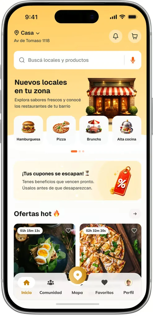
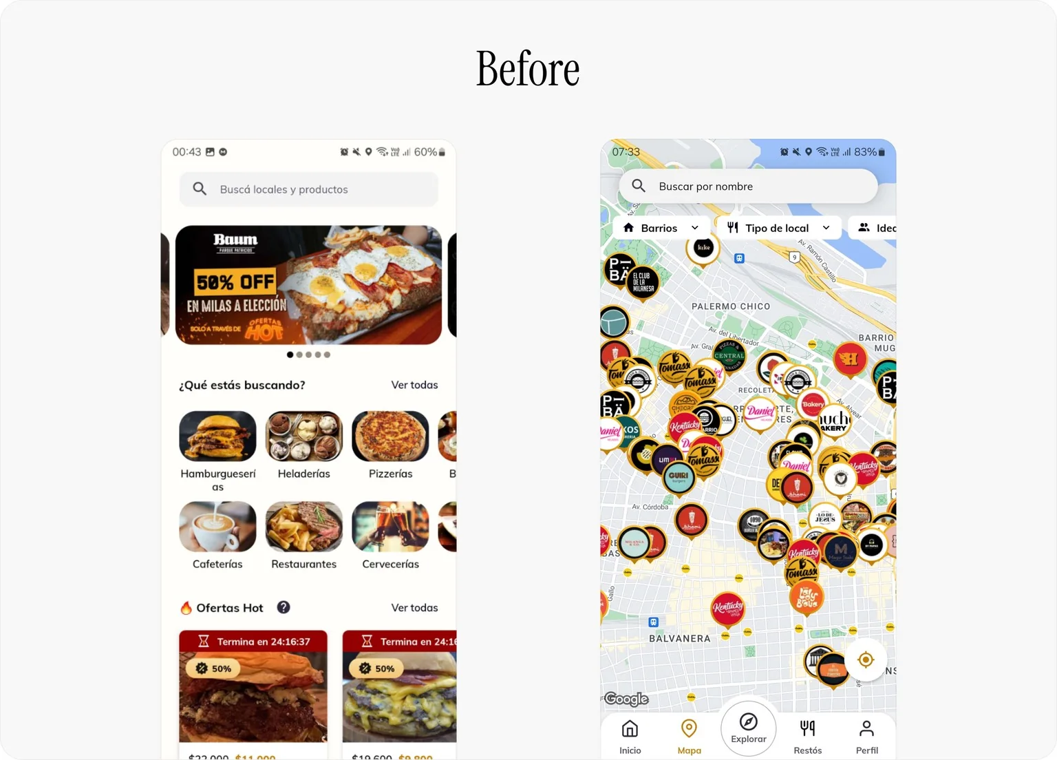
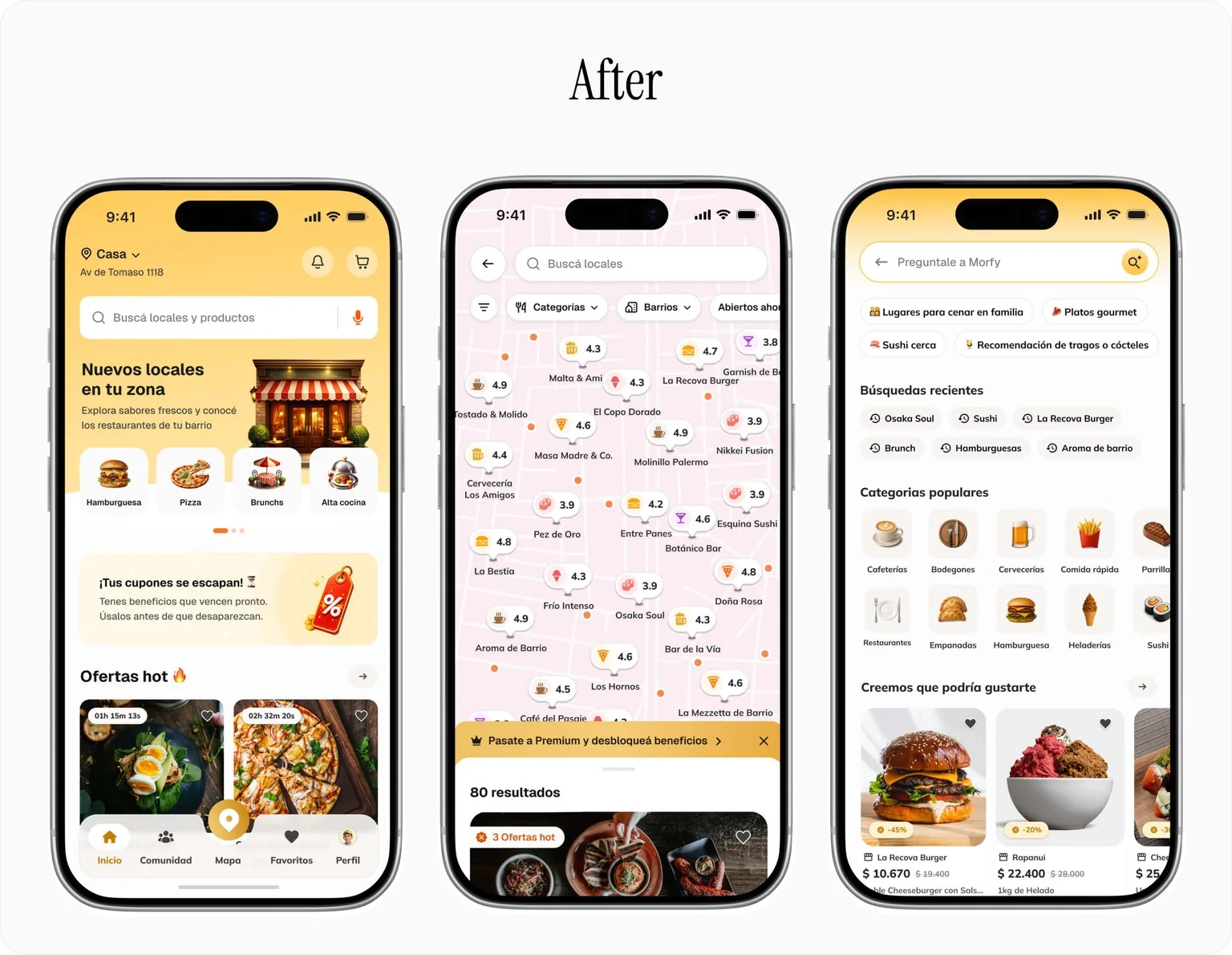
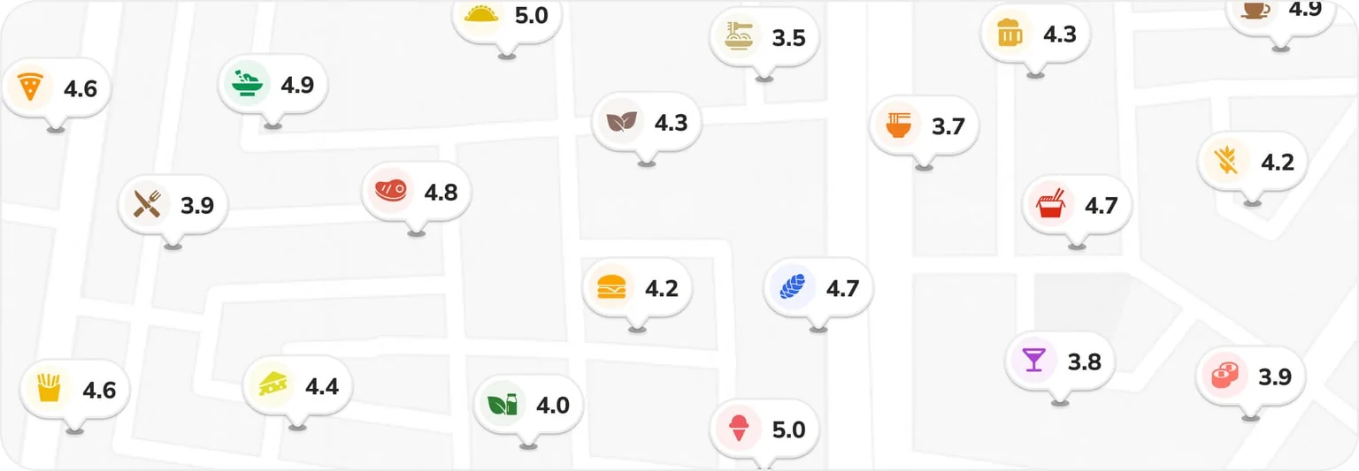
The challenge: Decision fatigue. As our restaurant base grew, the original Home screen and Map became overwhelming. Users were spending too much time scrolling without tapping, suffering from cognitive overload due to a lack of clear hierarchy and poor filtering options.
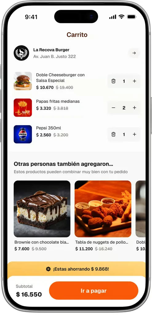
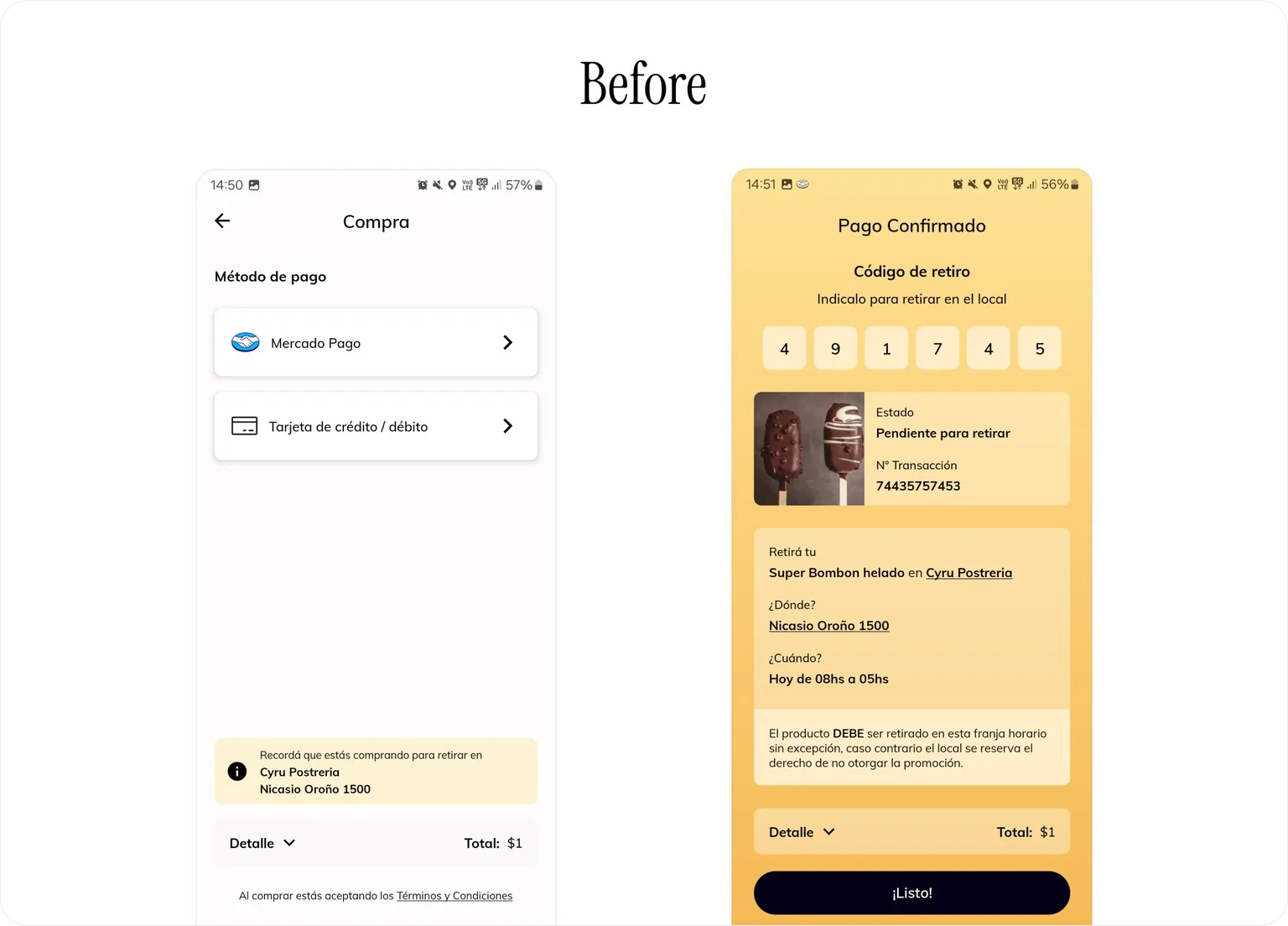
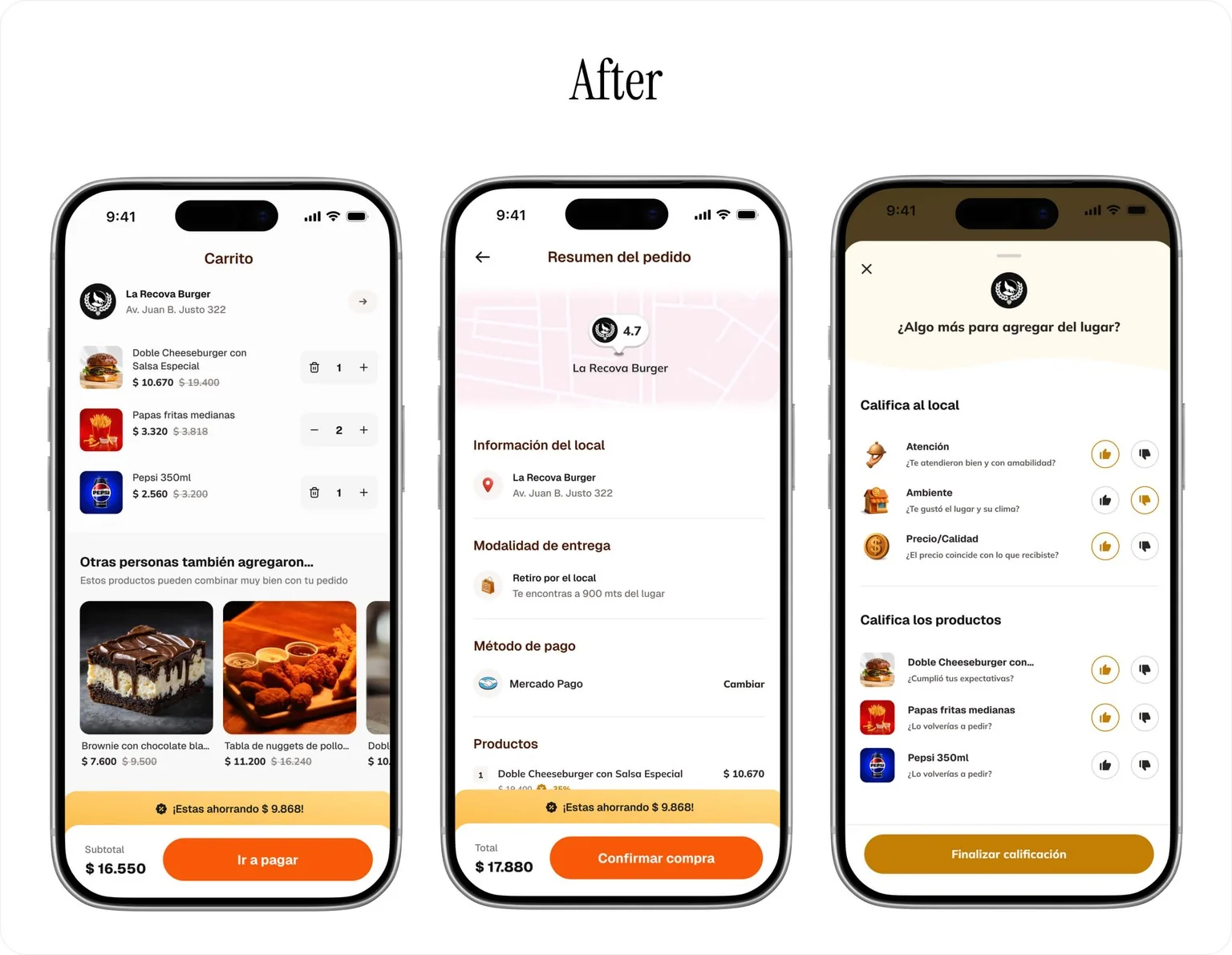
The challenge: Transactional Friction. While adding items was easy, a disjointed legacy payment flow caused cognitive overload and high abandonment rates. To fix this, I designed a Transparent Checkout Flow centered on confidence and error prevention. By proactively structuring pickup details and a clear receipt, we ensured users felt secure and fully informed about exactly where, when, and what they were paying for.
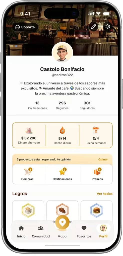
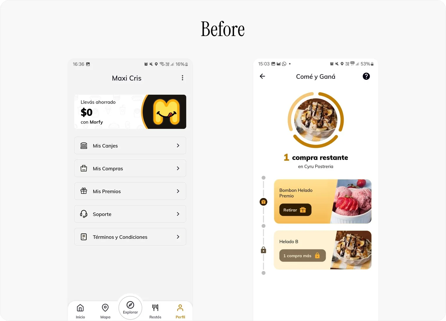
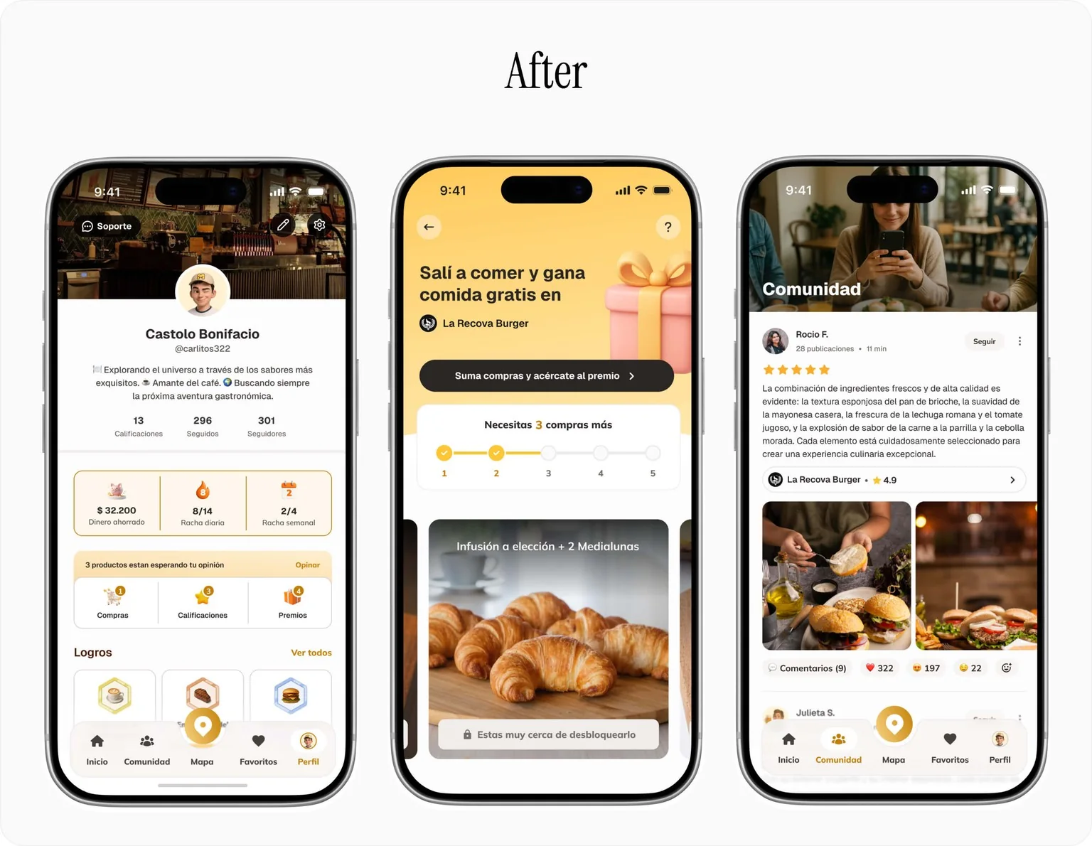
The Challenge: Closing the 'Single-Player' Gap: Morfy felt like a lonely experience, lacking social validation and community trust. Profiles were sterile, and loyalty felt like a chore. I needed to build a social layer that transformed 'loyal customers' into trusted community members, incentivizing high-quality reviews through shared achievements.

Working as a Solo Designer taught me to balance user advocacy with business viability. I learned that resolving "design debt" and creating a scalable system is just as crucial as launching new features. Every pixel pushed needs to have a clear correlation with a business metric like GMV or Retention.
While we conducted user testing, the sessions were too few and happened too late in the process to meaningfully impact the final screens. Looking back, I would advocate for more robust testing earlier on. Instead of just validating a single polished UI, I would present users with multiple design concepts to challenge our assumptions and let data drive the final decision.
With a robust discovery architecture and a growing base of User-Generated Content, the next phase is leveraging that data. I envision implementing smart, predictive recommendations that learn from a user's past orders, saved spots, and community interactions to offer highly curated dining suggestions, further reducing decision fatigue.
Si tenés una idea, un proyecto o ganas
de saludar, me encantaría leerte